 0 comments have been left for this article.
 BP Comment Quick Links

|

|
May 24, 2007 Schrodinger's BatBatter Versus Pitcher, Gameday Style
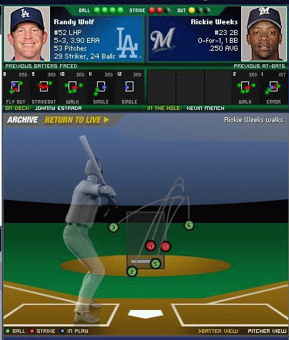
"Begin at the beginning and go on till you come to the end: then stop." There's no doubt that baseball provides a vast number of avenues for the fan who wants to sift through data. The geometric configuration of the field leads to players being responsible (for the most part, anyway) for their own territory. The turns of players at bat, the mano a mano battle of pitcher and hitter, and the limited options available to each player all combine to create, in the words of Bill James, an "orderly universe." That orderly universe generates a flow of discrete events that lend themselves to data capture, that in turn feeds the kind of analysis that attracts many of us. In this space in the last few months we've discussed a new source of information and hinted at how it opens up new avenues for analysis. This week we'll get our hands dirty and examine two aspects of that data, including pitch velocities and locations. As we'll see, just these two aspects lead to a number of other questions and directions, and in future articles we'll take on some of the other hidden gems, including pitch break and recognition. Crunching the Numbers Following the King's advice, let's begin at the beginning. The new version of MLB.com's Gameday application, then called Enhanced Gameday, was first unveiled in time for the 2006 post season. That version was the first to weave into the display the PITCHf/x data used to show the speed, location, and trajectory of each pitch. Previously, the location data was displayed after it was entered manually by operators of the Gameday application in the press box. The PITCHf/x technology was developed by Sportvision, the company that began with tracking hockey pucks in 1996, and later gave us the "1st & Ten" yellow lines so familiar to football viewers. Gameday has been in use for Major League games since 2001. In short, the system relies on three cameras installed at the ballpark that triangulate on each pitch at 30 frames per second. Three computers in a truck outside the park then process the data and calculate the various data points the system tracks, including the position, velocity, and acceleration of the ball. The cameras and software know where to look for pitches (actually they look for objects traveling between 40 and 120 mph), since when the system is first installed a virtual grid is laid down at each park marking home plate and the pitcher's mound. The moniker "Enhanced" has since been dropped, and now the 2007 version of Gameday is used for games both in parks that have PITCHf/x installed and those that don't. At the present time it appears the system is functioning in Texas, Atlanta, Anaheim, San Diego, Toronto, Oakland, Chicago (AL), Seattle, and Los Angeles (NL), and has at least been tested in Colorado, Detroit, St. Louis, and Washington. As of the games of May 21st, that means that 183 of the 657 games played (28%) have had at least some pitches tracked using the system--or, if you prefer, a total of 44,102 of the 190,350 pitches thrown (23%) during the 2007 season. The goal is to get the system running in all 30 parks by the end of the summer. When PITCHf/x is operational, the result is the kind of display seen below where each pitch is shown in a 3-D view, with the pitch data available in another pane of the application.
 Users of the 2007 version will no doubt also be pleased to know that an update to Gameday was released on May 10th that is "significantly less resource-intensive" and is reportedly faster than last year's version. The early returns from this user certainly back up that claim. Given that we now have over 40,000 pitches to look at, we'll do just that, slicing and dicing our way through the velocity and location data. Velocity The system begins tracking the ball at 55 feet from the plate, at roughly the release point. The average pitcher is 6 feet tall and strides 80% of his height. The pitch is measured at intervals as the ball approaches the plate. From that data, a release velocity and the velocity just in front of the plate is recorded. The highest speed recorded of any pitch as it left the pitcher's hand was the first pitch to Jose Guillen thrown by the Angels' Francisco Rodriguez in the bottom of the ninth inning at Seattle on May 17th: 104.3 miles per hour. That pitch, however, crossed the plate at just 82.0 mph. The fastest pitch to reach the plate was one thrown by Kyle Farnsworth of the Yankees to the Rangers' Victor Diaz on May 3rd, which was clocked at 92.4 mph. From an aggregate perspective, the top ten pitchers (with 20 or more pitches recorded) in average start and end velocity are shown in the table below.
Fastest Average Start and End Velocities
Name               Pitches  AvgMph
Joel Zumaya             62    97.7
J.J. Putz              189    95.1
Jonathan Broxton       225    94.6
Kyle Farnsworth         76    94.4
Mariano Rivera          42    93.8
Rich Harden             63    93.6
Brandon Morrow         198    93.5
Joe Nathan              37    93.5
Matt Thornton           94    93.5
Matt Capps              24    93.4
----------------------------------
Joel Zumaya             62    86.6
J.J. Putz              189    85.6
Mariano Rivera          42    85.2
Kyle Farnsworth         76    85.1
Tyler Yates            106    85.1
Rafael Soriano          96    84.6
Glen Perkins            33    84.5
Jonathan Broxton       225    84.2
Brandon Morrow         198    84.1
Rich Harden             63    84.1
The hurlers with slowest average start and end speeds are shown next.
Slowest Average Start and End Velocities
Name               Pitches  AvgMph
Tim Wakefield          259    68.7
Chad Bradford           20    75.6
Orlando Hernandez       54    77.5
Mike Maroth            119    78.8
Javier Lopez            21    79.5
Mike Myers              35    79.7
Doug Davis             100    79.9
Mark Redman            112    80.2
Tom Glavine             54    80.2
Livan Hernandez        110    80.8
----------------------------------
Tim Wakefield          259    61.7
Chad Bradford           20    67.0
Orlando Hernandez       54    70.6
Mike Myers              35    71.1
Mike Maroth            119    71.6
Doug Davis             100    71.9
Livan Hernandez        110    72.2
Bronson Arroyo         243    72.6
Javier Lopez            21    72.8
Matt Morris            289    72.9
Perusing the lists, there don't seem to be any surprises. What is more interesting is to note that the average pitch starts out at 87.6 mph and ends at 78.8 mph, while the average decrease in velocity is 8.8 mph. When averaging the percentage decrease, the average pitch ends up losing 10 percent of its velocity on the way to the plate. The average pitch is released 6.1 feet from the ground, and drops an average of 3.7 feet, so on average, it's losing 60% of its height on the way to the plate. On the subject of losing velocity, we can use this data to get a read on how much velocity starting pitchers lose as they move along during a game. To do so, we can examine the 241 times that pitchers have thrown 80 or more pitches in a game and chart their average velocities per inning. This incorporates more than 23,000 pitches, with the results shown in the graph below.
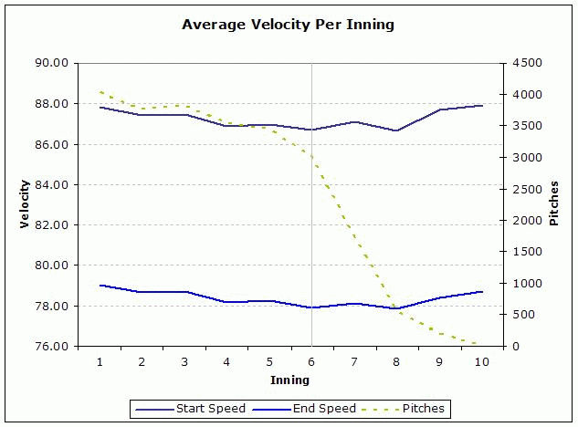 What this analysis reveals is that, as you might expect, velocity steadily decreases as the innings pile up. There's a sharp drop-off in the dotted green line corresponding to a steadying of the velocities in innings seven and eight, followed by an uptick as we reach innings nine and ten, reflecting a selection effect in play, as only pitchers who haven't lost anything pitch into those innings. Although there is something of a selection bias through the first six innings as well, the decline when looking only at innings one through six (denoted by the vertical grey line to the right of which the selection bias grows exponentially) is only 1.3% in terms of both average start and end speed, or just over 1 mile per hour in both cases. From this we may draw two inferences. First, as a general rule, pitchers are probably not taken out of games primarily because of their loss in velocity, but instead because of their loss of command. Secondly, there's no evidence that the delta in the velocity of pitches when they leave the hand and subsequently reach the plate differs as the games goes along. One might think that perhaps one of the ways that tiring would manifest itself is in mechanics that appear to result in the same arm speed and hence release velocity, but actually result in decreased velocity as the pitch nears the plate. This isn't the case, and the 10 percent rule always applies. It's also interesting to look at which pitchers vary their velocity the most and least by measuring the standard deviation of their pitches as they cross the plate. Pitchers who tend to vary little in this regard are generally those pitchers who throw fewer pitches in a single game--relievers--but also are more likely to be one-pitch pitchers (like Mariano Rivera, who relies on his cut fastball almost exclusively). Pitchers who vary greatly are likely those who feature an effective fastball and an effective off-speed pitch, notably Casey Fossum--the "Fossum Flop" which was recorded three times in his 87 pitches total, and crossed the plate at an average speed of 45 mph. The most extreme of these two distinct types make for a pretty interesting pair of lists:
Name               Pitches  AvgMph   Stdev
Dave Weathers           37    78.2     1.3
Mariano Rivera          42    85.2     1.5
Ron Villone             25    81.0     1.6
Cla Meredith           144    76.7     1.9
Jared Burton            27    81.8     2.0
Scott Schoeneweis       21    80.4     2.2
B.J. Ryan               46    80.2     2.3
Matt Capps              24    82.9     2.3
Juan Rincon             20    81.9     2.4
Nate Robertson          93    78.8     2.5
Greg Maddux            425    75.3     2.5
------------------------------------------
Eric Gagne              61    79.7     8.4
Randy Wolf             491    74.3     7.9
Brian Stokes            50    81.9     7.4
Casey Fossum            87    74.2     7.3
Josh Beckett            89    79.4     7.3
Kyle Snyder             21    74.6     7.3
Justin Germano         246    73.5     7.2
Vicente Padilla        733    80.7     7.0
Jorge de la Rosa       280    78.3     7.0
Brian Fuentes           51    77.6     7.0
It should be remembered, however, that decreases in velocity are affected by atmospheric conditions as well. In the nine parks in which over 4,000 pitches have been recorded, the average start, end, decrease, and percentage decrease in speed are given in the table below:
Park             Pitches   Start     End  AvgDec  PctDec
San Diego           4778   88.64   77.25   11.39  12.82%
Chicago             4748   88.89   79.03    9.86  11.08%
Los Angeles         5346   87.06   77.88    9.18  10.52%
Toronto             5296   87.23   78.32    8.91  10.19%
Seattle             5200   87.99   79.31    8.68   9.84%
Oakland             4777   86.18   77.82    8.36   9.68%
Anaheim             5106   87.70   79.60    8.10   9.21%
Atlanta             4109   86.78   79.62    7.16   8.23%
Texas               4402   87.56   80.61    6.95   7.91%
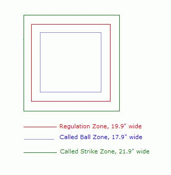
Keep in mind that air density depends on the temperature, the air pressure (affected by altitude and weather systems), and to a lesser degree, how much water vapor is in the air. For example, lower temperatures mean higher air density, higher pressures in lower altitudes or good weather means higher air density, and less humidity means higher air density. And yes, on those extremely humid days in Atlanta the air may not feel lighter, but it is, since water vapor molecules are lighter than either the nitrogen or oxygen which they replace when the air is humid. Taking that into consideration, it may not be surprising that San Diego, where the temperatures are relatively cool and the park is at sea level, might have higher air density and thus slow pitches down the most. At just 586 feet above seal level and with average game time temperatures in 2007 of 49.9 degrees Fahrenheit (coldest in baseball), Chicago might also be a good candidate for heavier air. On the other hand, Texas and Atlanta with their higher temps (68 and 72.5 degrees in 2007 respectively) and more humid conditions might well result in less dense air and therefore less air resistance to baseballs on their way to the plate. It'll be interesting to look again once more data at Coors Field is collected. In the small sample of 91 pitches, Coors did see an average percentage decrease in velocity of just 7.8 percent, which would put it behind even Texas. But "God giveth and God taketh away," so while batters might enjoy getting a few extra milliseconds to observe the pitch coming in, curveballs also curve more in higher-density air, so they'll likely need that advantage. Getting in the Zone The batter/pitcher match up is the central aspect of baseball and so it comes as no surprise that tools like Gameday are giving fans a more detailed look at what is, after all, the core of the game. And at the heart of that confrontation is what Joe Sheehan titled "The 510-Square-Inch War Zone" in a chapter of Mind Game . By virtue of tracking pitch locations in two dimension and individualizing strike zones for hitters, we can get a look at how just where and when strikes and balls are called. First, however, we'll need to explain how we determine whether a pitch is in the strike zone or not. Gameday reports the top and bottom of the strike zone for each hitter in every plate appearance. Given that the plate is 17 inches wide and the radius of the baseball 1.45 inches (accounting for the possibility of any part of the ball touching the zone), we can draw a "war zone" for each plate appearance. As you can imagine, the sizes of the zones differ for different hitters. To get a feel for the range of the zones, the following table lists the top and bottom 10 in terms of square footage for players who have seen 20 or more pitches.
Strike Zone Sizes
Name             Pitches   Sq Ft
Chris Young           43    3.91
Conor Jackson         22    3.83
Richie Sexson        313    3.79
Adam LaRoche          24    3.75
Troy Tulowitzki       68    3.74
Greg Maddux           20    3.72
Chris Stewart         62    3.70
Matt Holliday         94    3.69
Chris Duncan          97    3.68
Austin Kearns         70    3.68
--------------------------------
Juan Castro           44    2.64
Brandon Phillips      96    2.65
Willie Harris        117    2.71
Gregg Zaun            83    2.73
Rob Mackowiak        192    2.79
Juan Uribe           216    2.81
John McDonald        135    2.82
Todd Walker           60    2.84
Chris Duffy           30    2.84
Albert Pujols        108    2.84
So while the area of turf that Conor Jackson does battle in is over 550 square inches, Juan Castro must defend a little more than 380 square inches of territory. I'm not sure how Greg Maddux made the largest strike zone list, but it may be that he stands more upright at the plate than most, or simply a data problem given the small sample size of just 20 pitches. In addition to knowing each hitter's strike zone, we must also take into account the accuracy of the system. In a recent blog discussion, Cory Schwartz, Director of Stats at MLBAM, noted that as the ball nears the plate the accuracy of the measurements should be within one inch. So, accounting for this possible variation we'll need to expand our zone by an inch in both the height and width dimensions for pitches that were called strikes to give the umpire the benefit of the doubt, and contract our zone by an inch on all sides on called balls. A picture may tell the story more clearly.
 Using these zones we can now calculate how many pitches were called balls and strikes along with how many the system agreed with the umpire on.
Type          Pitches   Agree     Pct
Called Strike    6868    5530   80.5%
Ball            13902   13103   94.3%
Total           20770   18633   89.7%
Overall, about 90 percent of the pitches were called "correctly," with a far greater percentage of balls finding agreement than strikes. In other words, when a ball was called by the umpire, 94.3 percent of the time the pitch was not within the blue strike zone in the diagram above. On the other hand, 80.5 percent of the time that a strike was called, the pitch was within the green zone, leaving almost 20 percent of the strikes outside of the most expansive zone that takes into consideration both the width of the ball and a one inch buffer on all sides. When this is broken down a little further based on the handedness of the batter, an interesting picture develops:
Type       Bats        Pitches      Agree     Pct
Ball          L           6483       6127   94.5%
Called Strike L           3193       2424   75.9%
-------------------------------------------------
Ball          R           7419       6976   94.0%
Called Strike R           3675       3106   84.5%
While balls are called at pretty much the same rate on both lefties and righties, strikes are called more frequently on lefties when the pitch is out of the zone. But, inquiring minds want to know, just where in the zone is it that lefties are getting the shaft? We can then break this down a little further, by looking into quadrants of the strike zone (with the orientation as if looking at the strike zone from the pitcher's mound), as shown here.
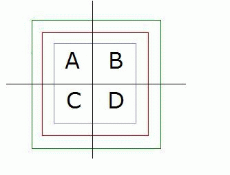 The following two tables then represent the pitches in each zone and what percentage was in agreement:
Lefty Hitters
Type            Quad        Pitches   Agree     Pct
Ball               A            757     667   88.1%
Ball               B           1946    1878   96.5%
Ball               C           1454    1344   92.4%
Ball               D           2326    2238   96.2%
---------------------------------------------------
Called Strike      A            346     311   89.9%
Called Strike      B            985     676   68.6%
Called Strike      C            540     493   91.3%
Called Strike      D           1322     944   71.4%
Righty Hitters
Type            Quad        Pitches   Agree     Pct
Ball               A           1550    1459   94.1%
Ball               B           1268    1194   94.2%
Ball               C           3193    3034   95.0%
Ball               D           1408    1289   91.5%
---------------------------------------------------
Called Strike      A            932     767   82.3%
Called Strike      B            641     549   85.6%
Called Strike      C           1375    1163   84.6%
Called Strike      D            727     627   86.2%
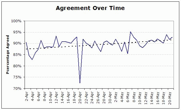
A straightforward reading of this table indicates that left-handed batters have a small advantage in getting balls called on pitches up and in (zone A), but that advantage is more than offset by the fact that they see more called strikes on pitches that are away (zones B and D). Right-handed hitters, on the other hand, do a little better on pitches down and in that are called for balls, and a little worse on pitches up and away being called strikes. Why these differences seem to exist is unclear, although umpire positioning may play a role. It should be noted that in an article titled "Cameras and Computers, or Umpires?" that was published in Volume 32 of SABR's The Baseball Research Journal, Robert K. Adair noted that in 2002 about 600 games were tracked with QuesTec. In that sample of 83,891 pitches, QuesTec and the umpires agreed on 71,164 of the pitches, or 84.8 percent. When pitches within two inches were excluded (the buffer considered within the uncertainties of the system) they agreed on 90.8 percent of the pitches, bringing it in line with the results here, although it should be pointed out that their buffer was larger. Adair also mentions that about three percent of the pitches were thrown out by the QuesTec operators as "bad tracks." In the 183 games of data used for this article, 13.8 percent of the pitches were not recorded with PITCHf/x data. Some of this is certainly due to the testing that is done as ballparks are brought online (I did not exclude any pitches that were tracked), although it would seem that more pitches are being excluded. Finally, it is possible that the agreement rate will continue to improve as the system is tweaked at the various ballparks. The graph below shows the agreement rate versus time for 2007, and as you can see the rate has indeed risen a little as the season has progressed, although generally it is between 88-91 percent. The anomaly on April 20th was likely due to calibration issues, since it involved only 218 called strikes and balls recorded in four separate games, where just 41 pitches were registered in Detroit, 50 in Texas, two in Los Angeles, and 125 in Seattle, with the percentages low across the board. One would expect the percentage to increase slightly and then level off when all the ballparks are brought online, since there is a fairly positive correlation between number of pitches tracked and agreement percentage at the various ballparks.
 Opening the Box Now that we have these sorts of tools at our disposal we can begin to ask and answer a variety of interesting questions. Which hitters tend to get bad calls? Which pitchers get the benefit of the doubt most often? On what counts is it more likely that pitchers or hitters will benefit? Which hitters swing at pitches out of the strike zone? What is each hitter's batting average when swinging at pitches in specific zones (the Ted Williams model)? How frequently do pitchers target specific zones against certain hitters? The list goes on and on from there--let's get started.
|