


 1 comment has been left for this article.
 BP Comment Quick Links

|

|
May 21, 2015 Pitching BackwardHow Offense is CreatedBy now the decline of offense has been well documented and thoroughly discussed. Knowing that, this post isn’t going to be about how offense is down, or why, or whether the trend can be reversed. This post has a simple goal: to better visualize how offense is created across the MLB player pool. More specifically, we want to look at the distribution of offensive value through the lens of linear weights. There are two main parts to understanding this topic more thoroughly. The first is to look at how, on a league-wide basis, offensive value is broken down among each of the components that go into wOBA, one total-offense statistic that uses linear weights for each offensive act to measure a hitter's production. The second and more complicated part involves seeing how these components are distributed across the player population. This second part is the really fascinating stuff, but first we need a baseline in order to better understand the context for that analysis. To work through the first part of this analysis, we needed to break wOBA down into its component pieces. We can then analyze how those components come together to generate offensive value, and how that might differ from one player to the next. The data set I pulled listed the number of singles, doubles, triples, etc. that each qualifying player had over the course of the 2014 season, giving the base for the analysis that we wanted to perform. I then created a second spreadsheet that multiplied these raw numbers by the run-scoring (linear) weights used in the wOBA calculation for 2014. This allows us to identify how offensive value was distributed among the components that make up that value. That is, we can slice up all the offensive value created by the league last season by the components of wOBA. Here’s a look at how the league fared as a whole:
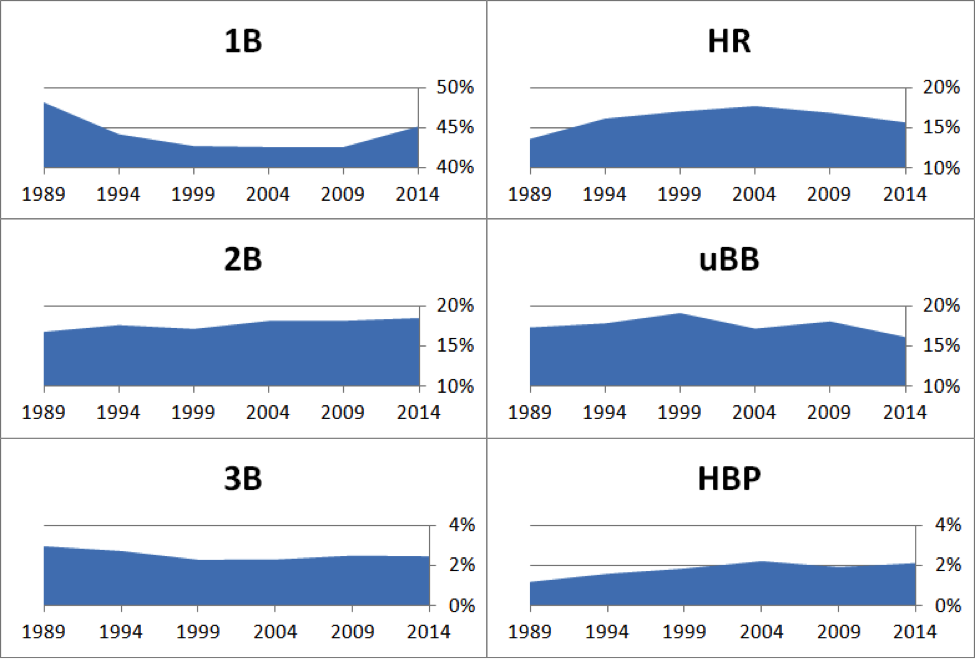
This means that singles were responsible for 44 percent of all offensive value generated last season by qualifying players, doubles accounted for 19 percent, and so on. These percentages are pretty stable over time, because within each season the linear weights are adjusted in order to properly capture the run-scoring environment from that year. To quickly illustrate the stability of wOBA production over time, I charted out the percentages of overall offense that each component was responsible for, every five seasons from 1989 to 2014 below:
The biggest change here is when the offensive value generated by singles dropped about 5 percentage points during the Steroid Era, only to bounce back in 2009 and last season. The main takeaway here is that in any given season, the distribution of offensive production among the components that create offense is fairly steady. That doesn’t, however, mean that the distribution of talent across the league is even. This should make intuitive sense. We know that we can take players and bucket them by their skill sets, because different players have different strengths and weaknesses. Miguel Cabrera creates a lot of value by hitting home runs, but not a whole lot by hitting triples. Starling Marte creates his offensive value by getting hit by pitches, but doesn’t create so much by taking walks. In order to understand how these relatively stable components of offensive production are distributed across the league we’ll turn to Ayasdi Core—a tool we introduced a few weeks ago that allows us to generate topological maps of our data sets—to visualize the distribution of offensive talent across the league.[1] This will help visualize the distribution of offensive production for the various wOBA components across the league. Here’s how the ability to create offensive value is distributed across the league:
In this map, areas of bright red are players with the highest wOBA, while dark blue areas are players who had the lowest wOBA. The range of wOBA for this sample goes from under .275 to over .405. You can see that there are some distinct clusters in the image above. The flare on the right has a lot of orange and red—this group comprises some of the best offensive players in baseball. On the other end of the spectrum, there are a few blue flares in the middle of the image where offensive production is low. This image is nice to look at, but it’s not particularly insightful. It simply visualizes something we can all go easily look up in a leaderboard. The value in bringing Ayasdi Core into this analysis is that it can help us identify the components of wOBA and how they are distributed across the league. You will, however, want to refer back to the image above as we look at this in more depth, so take a moment to really take it in before moving on. The next step is looking at the components and how they are distributed across the league. We already know how much of the offensive value generated by players came in the form of singles, but we don’t know how evenly that value is spread across all players in the game. The GIF below shows how the map of offensive production from above changes when we view it through the lens of the various offensive components included in calculating wOBA. To do this we mapped the data and then applied a color filter based on the offensive value generated by singles, doubles, triples, and so on. The result is the following: I’m not going to go into depth on all of these components, but I will make some overarching comments that will hit on a few of them. The most obvious takeaway is the impact speed has on the game. The leftmost flare shows up in a significant way for triples, stolen bases, and caught stealing. This portion of the overall population also includes most of the top singles hitters in baseball, so speed comes through again as a crucial component of this group’s ability to generate offensive value. The players in the left section of the map are attempting more steals, succeeding more (on a raw numbers basis, not necessarily a percentage basis) than the rest of the league, hitting triples, and legging out singles more than the rest of baseball. For these players, offense is a function of their legs as much as their bats at times. The map for home runs that is included below is another example of a distribution with both dense and sparse areas:
The rightmost flare is densely populated with home run hitters, a group that correlates highly with the high wOBAs we saw in the initial map above. In general the right side of the map produces more value via the long ball, whereas the speedy side that we identified previously has a more sparse distribution of home run hitters. We know that home runs made up 17 percent of the total offensive value created in 2014, and now we can also say that a small portion of players are generating the majority of that value. The goal of this particular analysis is to look at the distribution of offensive production, but I’d be remiss if I mentioned that home runs are hit by a small subset of the population but didn’t give a sample of the players represented in this portion of the map. There aren’t as many surprises here as there were in our first analysis using Core, with familiar powerful names like Andrew McCutchen, Jose Abreu, Giancarlo Stanton, Mike Trout, and Nelson Cruz showing up in this portion of the map. While these two components of wOBA show denser clustering in certain portions of the map, that doesn’t necessarily hold true for other components. Let’s examine the distribution of doubles, for example. This component features a fairly even distribution across the league, though there are a few bright spots worth noting:
There are red groups in the speed-based portion of the map we just discussed, and there are some red groups in the far right group. The group on the right is able to generate doubles as a result of their power, something that would have been partially picked up with the ISO that we used in the analysis a few weeks ago. The group on the left has two things going for it: speed and high contact rates. We already know they’re hitting a lot of singles and possibly also stealing bases at a higher rate. As a result, those skills sometimes collide, resulting in an uptick in doubles among those players as well. All this isn’t to say that these types of analyses are always conclusive, though. In the case of unintentional walks, the distribution raises more questions than it answers. Sure, the red/orange areas among the far right flare makes sense given their proclivity for hitting home runs, but the yellow/orange spots in other sections of the map aren’t as obvious. If the goal here was to look at the ability to get on base through non-batted ball means, the OBP group from my first analysis is probably a better measuring stick for that. As it is presented here though, the main takeaway appears to be that the ability to draw unintentional walks isn’t directly tied to another skill except maybe home run hitting, for obvious reasons. The same conclusions could likely be drawn from the hit-by-pitch color filter as well. There are some hot spots all over the map, leading me to believe that there is little connection between getting hit by pitches and other offensive skills. Now, some might argue whether or not getting hit by pitches is a skill in itself, something that we could possibly dig into in future iterations of this analysis. For now though, we’re simply looking at it in relation to other offensive components. Let’s take a quick look at bringing that distribution to life in a more concrete manner. Below is a sampling of three players who come from different portions of the maps we’ve shown above. By calculating the percentages for each component we can see the distribution in a more real sense:
These individuals represent three different sections of the map, but aren’t special or necessarily representative of their respective sections, as they were randomly selected. They do highlight some of the main points made earlier. Rizzo, who belongs to the right flare, where home runs are king, has a significant portion of his production coming from the long ball. Melky Cabrera and David Freese, on the other hand, generate much more of their offensive value via singles and doubles than does Rizzo. Melky also has the benefit of adding a percentage point with stolen bases and triples compared to the other two players. This really helps put a finer point on what we’re truly looking at here. We can see, anecdotally, that Rizzo and players like him create more of their value from home runs. Seeing how this production is distributed aids our understanding of offense and how it is actually created. This type of analysis isn’t going to give us a magic bullet or a list of recommendations to bring run-scoring back up to early-2000s levels, but it will help us better understand how offensive value is created across baseball. By better understanding how offense is generated, we can more confidently assess the implications of trends in player valuation or performance. Even something as simple as the components that make up wOBA can prove to be incredibly complex when we look at it across all of MLB. Using cutting edge technology to identify and map out the connections these relatively simple stats have into a much bigger picture will help give us more context through which to understand what’s happening to offense in baseball. [1] I won’t get deep into the math behind the tool or the technical details of what I did here, but feel free to email me if you want to discuss how the maps were generated.
Jeff Long is an author of Baseball Prospectus. Follow @JeffLongBP
|
I really enjoyed this. Looking forward to more like it.