Curveballs fascinate me. They must fascinate other people too, because NASA has a (slightly outdated) webpage dedicated to explaining the physics of the phenomenon. Sure, other pitches can be really entertaining. Aroldis Chapman unfurling a 100+ mph fastball is awesome, no doubt. Seeing hitters flail at Masahiro Tanaka’s splitter is entertaining, to say the least. Seeing despair on the faces of opponents after Felix Hernandez throws a changeup is always going to be fun. But there’s something deeply fascinating about a pitch that appears to do things our brains are pretty certain aren’t possible.
That mustachioed man almost fell over because of that curveball!
That curve bounced and the hitter still swung at it!
Some curveballs are really slow.
Others kind of move like a Frisbee.
This one caused Ruben Tejada to attempt twerking.
Sonny Gray’s curveball is so good it scared Adrian Beltre, and he’s sort of a good hitter.
While studying the various curves thrown last season, I became interested in how they might change from year to year. More specifically, how might the physical properties of the pitch change from one season to the next among pitchers who throw them at least occasionally? Are they moving more or less? Are they being thrown harder or slower? What is the effect on pitch usage and effectiveness? In order to study all of this I pulled PITCHf/x data for every starter who threw at least 50 curves in both 2013 and 2014. I didn’t include relievers, largely because the data was too noisy for this comparison.
First, some quick notes on velocity, pitch usage, and myriad other interesting stats. The average velocity of a curveball in 2013 was 78.29 mph. I used decimals to the hundredths place because the average velocity of a curveball in 2014 was 78.31 mph, so basically the same thing. From last season to this one, the average curveball velocity increased just 0.03 percent.
The average curveball usage rate among starters who threw at least 50 curves in ’13 and ’14 did increase by 2.6 percent, going from 14.9 percent of their pitches in 2013 to 15.3 percent last season. So keep in mind, as we move forward, that curveball usage was up, a little, from 2013 to 2014.
One additional and important thing to understand for what will come next is whiff rate, which we’ll use as a proxy for effectiveness. Whiff rate is the number of whiffs per swing, and it increased by just 0.7 percent from 2013 to 2014. The average starter in 2013 got a whiff on 27.27 percent of swings at his curve. This past season that number would increase to only 27.46 percent.
We’ll keep all that in mind as we explore how the curves thrown from 2013 to 2014 changed:
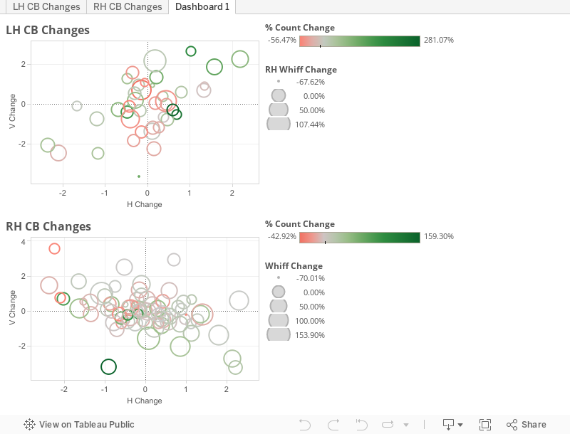
There’s a lot to digest here so we’ll take it piece by piece. The charts themselves show how the movement profile for each pitcher changed from 2013 to this season. The chart at the top is for left-handed pitchers, and the chart at the bottom is for right-handers. You can also click the tabs above the data presented to see each of the charts larger.
I’ve also altered the sign for the movement of the lefties so that it makes more intuitive sense, since the pitch is coming from a left handed pitcher as opposed to a righty. For each pitcher, the intersection of the X and Y axes is their average curveball movement from 2013. That makes each point in the scatter plot the 2014 location, compared to last year, for the pitcher’s average curveball.
Here’s a quick example to show how that works. On the lefty chart, the top right circle is the Rangers’ Martin Perez. (Note that hovering over an individual point will tell you which pitcher it represents and all the stats relevant to that pitch.) Perez’s curve is way up in the top right quadrant—hovering over his circle will tell you that Perez’s curveball “dropped” 2.2 fewer inches and “broke” 2.2 fewer inches in 2014, compared to the previous season. (For the purpose of this post I’ll use variants of the words “drop” and “break” to denote vertical and horizontal movement respectively.) If you were looking at the strike zone from the catcher’s point of view, you’d see Perez’s 2013 curve breaking to the intersection of the axes on the graph, while his 2014 curve ended up 2.2 inches higher and 2.2 inches further to your right.
The color of each point indicates whether the pitcher threw more or fewer curves in 2014, with darker green indicating a larger increase in curves and bright red being a larger decrease. This is scaled to their other pitches, so things like injuries won’t affect the pitch usage data presented here. It’s also important to note that the scales to the right of the charts are specific to starters of the same handedness, so keep that in mind as you view the colors for each point.
We can see that Perez’s point is a faint green, which indicates that he threw curveballs slightly more frequently in 2014 than he did in 2013. In fact, his 2.39 percentage point increase in curveball usage is right around the league average that we noted above.
Finally, the size of each point corresponds to the whiff rate change for each pitcher. That means that a quick glance at the size of each point will tell you how the whiff rate for each pitcher increased or decreased from 2013 to 2014. Theoretically, this gives a glimpse into each pitcher’s thought process regarding curve usage. For example, if a pitcher’s curve was more “effective” in 2014, did he opt to throw it more or less?
Perez’s point in the top right corner of the lefty chart is a little bit on the larger side compared to other left-handed pitchers, which means his curve was more effective last season than it was the year before. His whiff rate increased more than 58 percent from 2013 to 2014 despite “losing” movement in both the horizontal and vertical planes, and throwing it slightly more frequently.
Perez underscores an interesting finding—there seems to be no correlation between the change in movement and an increase in whiff rate; so a change in pitch movement doesn’t necessarily indicate an increase in whiff rate. Part of the reason for this could be that having a big breaker isn’t the most important factor for improving whiff rate. One of the key takeaways from my earlier analysis on Marcus Stroman, for instance, was that late quick movement can be as effective, if not more so, than having a big breaker.
Now that we’ve walked through exactly how to interpret the data and the accompanying visualization, let’s look at a few other examples to see what exactly changed from last season to this one.
One of the more interesting comparisons is between two pitchers who use their curveballs very differently. Cole Hamels and Drew Pomeranz both saw movement increases of more than three inches in their curveballs from 2013 to 2014. In fact, Hamels and Pomeranz were the only pitchers who saw an increase of more than two inches on both the horizontal and vertical planes. The two lefties had the largest increases in horizontal movement among their peers and both were among the top four when it came to increases in vertical movement as well.
Hamels is most known for his change, so it shouldn’t be a surprise that his curveball is his least-used pitch. He throws his curve less than 10 percent of the time, using it as a change of pace in a repertoire consisting of three different fastballs and that changeup. Pomeranz, on the other hand, relies heavily on his curve, throwing it more than a quarter of the time. He’s a three-pitch pitcher, so he really only has a four-seam and two-seam fastball to go with the curve, making the breaking ball a vital component of his repertoire.
Hamels’ curve is a true swing-and-miss pitch, with more than 41 percent of swings at it coming up empty. That rate is 24 percent better than the average curveball across the league last season. Pomeranz’s curve was pretty good by whiff rate, too, though—in much heavier usage—not quite as striking as Hamels’. Pomeranz got whiffs on more than 37 percent of his curves, roughly 18 percent better than the average MLB pitcher.
It’s important to remember that Pomeranz is at a disadvantage here because he uses his curve much more often than Hamels, so hitters are looking for it more often. That would make it more difficult for Pomeranz to see the same whiff rate (among other things) because hitters are expecting it
Both pitchers saw increases in whiff rate from 2013 to 2014, though Hamels’ improvement was more modest than Pomeranz’. Hamels saw his whiff rate increase 21 percent year over year, while Pomeranz had a more significant jump at 36 percent. But regardless, both pitchers saw their curves become more effective over the last 12 months.
But while the improvement in whiff rates was similar, they didn’t translate into the same usage patterns. No, Hamels increased his curveball usage by more than 25 perncent while Pomeranz decreased his by more than 10 percent.
Now there are some things to keep in mind when considering the numbers mentioned above. Hamels throws so few curves that even a small increase shows up as a significant jump in usage. It also means that whiff rate increases are potentially amplified due to the smaller sample size.
There’s another interesting oddity that separates Hamels and Pomeranz. The two pitchers throw different types of curveballs, though the movement profiles for each aren’t exactly what you would expect. Pomeranz throws a knuckle curve, as you can see in this fantastic GIF from Fake Teams:
Hamels throws a traditional curveball, and we’re lucky that he shared his grip with Men’s Health magazine some five years ago for our viewing pleasure. Granted, that image is woefully outdated, but we can corroborate it with this image from his August 9th start against the Mets.
Dan Rozensen basically wrote the book (or article as it were) on the difference between knuckle curves and traditional ones, so his work is particularly relevant here. Dan found that knuckle curves are generally thrown harder, something that holds true in our case study of two pitchers. Pomeranz throws his knuckle curve 82 mph on average, while Hamels comes in at a more pedestrian 79 mph. Both guys throw their curves a bit harder than the averages Dan found for all curveball-throwers of the same type, which is interesting given that both guys saw significant increases in movement from one year to the next. Additionally, both pitchers saw their velocity increase by a few ticks, with Hamels’ going from 77 to 79 mph and Pomeranz seeing his velocity increase from 79 to 82 mph.
It’s very interesting that the two pitchers would be able to see such significant increases in movement despite throwing relatively hard breaking balls. You might suspect that Pomeranz would be at a disadvantage because he throws harder, but Dan Rozensen debunked that theory:
Additionally, the spin data suggests that rotation rate on knuckle curves is roughly equivalent. The spike and knuckle grip group was therefore able to add speed to the pitch without sacrificing spin deflection.
Speaking of spin rate, that is ultimately one of the causes of the increased movement for both pitchers. From 2013 to 2014 Hamels and Pomeranz both saw an increase in spin rate of about 500 RPM, with Pomeranz’s curve coming in at ~1500 RPM and Hamels at ~1200 RPM. This helps to explain why a) Pomeranz’s curve actually breaks more than Hamels’ despite being thrown 3 mph harder on average, and b) the two pitchers were tops among lefties in increasing their curveball movement.
We'll note here that there are other measures of the effectiveness of a pitch, such as the ability to throw it for strikes, which is outside the scope of our inquiry. But all of what we've said here bodes well for both pitchers. Recently Chris Mitchell found that increases in velocity and spin rate correlate to overall pitch effectiveness, which helps explain the uptick in whiff rate for the two pitchers last season. I admittedly haven’t done the research, but I’d suspect that Hamels and Pomeranz had some of the largest increases in overall pitch effectiveness by Mitchell’s measure.
At the end of the day, what does this all mean? Well, it suggests that whoever trades for Hamels should have a little more confidence that he’ll age gracefully. His changeup is already a plus pitch, and an improved curveball will no doubt help him as he inevitably loses velocity throughout the duration of his contract. Hamels’ secondary offerings are all very good, so the team that acquires him can sleep easy knowing he won’t implode on them.
This article will also be the 3,692nd in BP history that lauds Billy Beane and his front office. The A’s might have a player on the verge of a breakout, his upside limited only by his ability to stay on the field and out of the trainer’s room. Pomeranz might always have some platoon issues because he lacks a decent changeup, but his curveball is an excellent offering to go along with his fastballs. Since Pomeranz relies so heavily on his curve, it’s not a far logical jump to say that the significant improvement he showed with the pitch will result in a much better overall pitcher long term.
By looking at the periphery of the movement changes from one season to the next, we’re able to identify players of interest. More thorough analyses, like those presented here, can then help identify what exactly is causing those changes in the profile for the pitches in question, and determine whether it has any long-lasting impact. This is just the tip of the iceberg, because each and every pitcher included in those charts above is worth looking into. And let’s not forget that this is solely focused on curveballs, which means that there are many more pitches worth looking into for all pitchers across the majors.
Thank you for reading
This is a free article. If you enjoyed it, consider subscribing to Baseball Prospectus. Subscriptions support ongoing public baseball research and analysis in an increasingly proprietary environment.
Subscribe now
Question about Jordan Lyles - his curveball dropped and broke a lot less. He played for HOU in 2013 and for COL in 2014. Is some of that change Coors-related? My recollection is that Coors isn't great for curveballs.
Perhaps we could do a study around park effects for spin rates...
"Spin from pitchf/x is estimate based on movement, using a fixed (not actual) air density. So spin is underestimated at Coors."
So maybe the changes in CB spin rate (for Pomeranz & Lyles) aren't telling the whole story. That said, the change in movement is very real (and since spin rates are calculated from movement, changes in spin rates are even more unreliable for people moving in/out of COL).